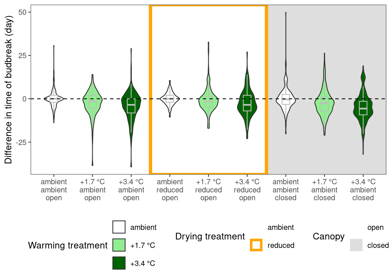
Visualize differences between treatments
dat_phenophase_diff <- calc_phenophase_diff(dat_phenophase_time_clean)
plot_metric_difference(
  dat_diff = dat_phenophase_diff %>% filter(species == "aceru", phenophase %in% c("budbreak")) %>% tidy_phenophase_name(),
  type = "phenophase", x_label_short = F, simple = F
)
Visualize observational trends
dat_climate_spring <- summ_climate_season(dat_climate_daily, date_start = "Mar 15", date_end = "May 15", rainfall = 1, group_vars = c("site", "block", "plot", "canopy", "heat", "heat_name", "water", "water_name", "year"))
# dat_climate_fall <- summ_climate_season(dat_climate_daily, date_start = "Jul 15", date_end = "Sep 15", rainfall = 0, group_vars = c("site", "canopy", "heat", "heat_name", "water", "water_name", "year"))
plot_observational_trend(df = dat_phenophase_time_clean %>% filter(species == "aceru", phenophase %in% c("budbreak")) %>% tidy_phenophase_name(), dat_climate_spring, type = "phenophase", season = "spring")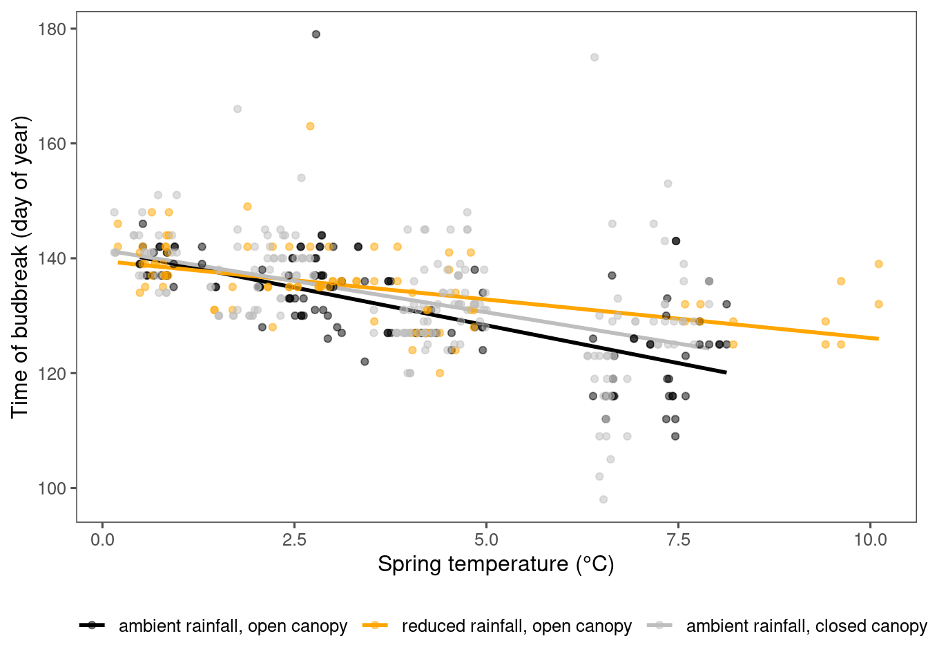
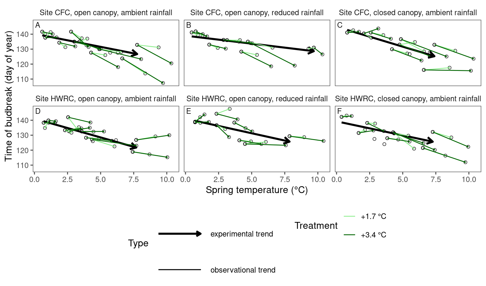
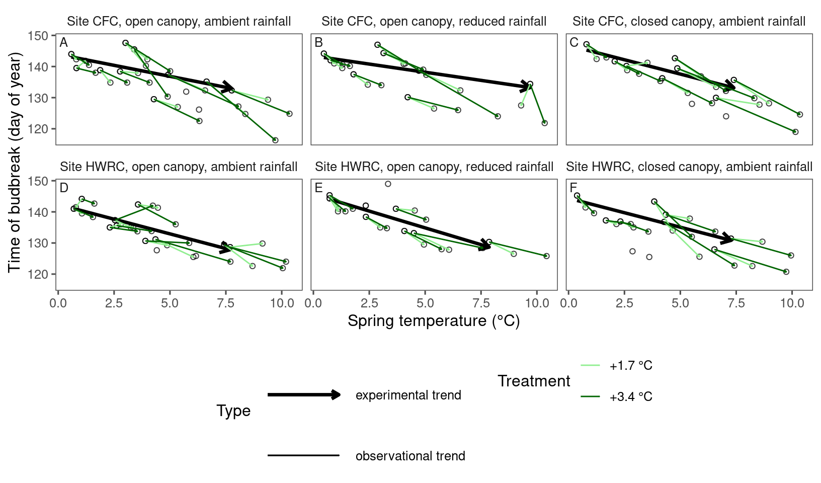
Visualizing experimental and observational trends together with arrows
dat_phenophase_time_summ <- dat_phenophase_time_clean %>%
  summ_metrics(level = "heat", type = "phenophase") # ignore block and plot

dat_climate_spring_summ <- summ_climate_season(dat_climate_daily, date_start = "Mar 15", date_end = "May 15", rainfall = 1, level = "heat")
plot_trend(
df = dat_phenophase_time_summ %>%
filter(phenophase == "budbreak") %>%
filter(species == "aceru"),
dat_climate = dat_climate_spring_summ,
type = "phenophase",
side_by_side = T
)
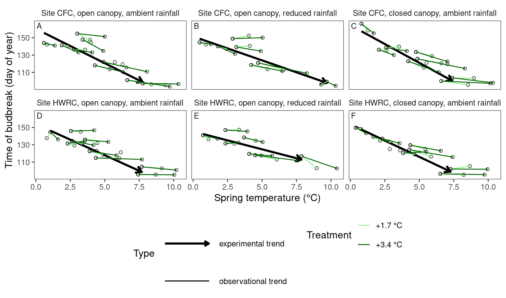
plot_trend(
  df = dat_phenophase_time_summ %>%
    filter(phenophase == "budbreak") %>%
    filter(species == "acesa"),
  dat_climate = dat_climate_spring_summ,
  type = "phenophase",
  side_by_side = T
)
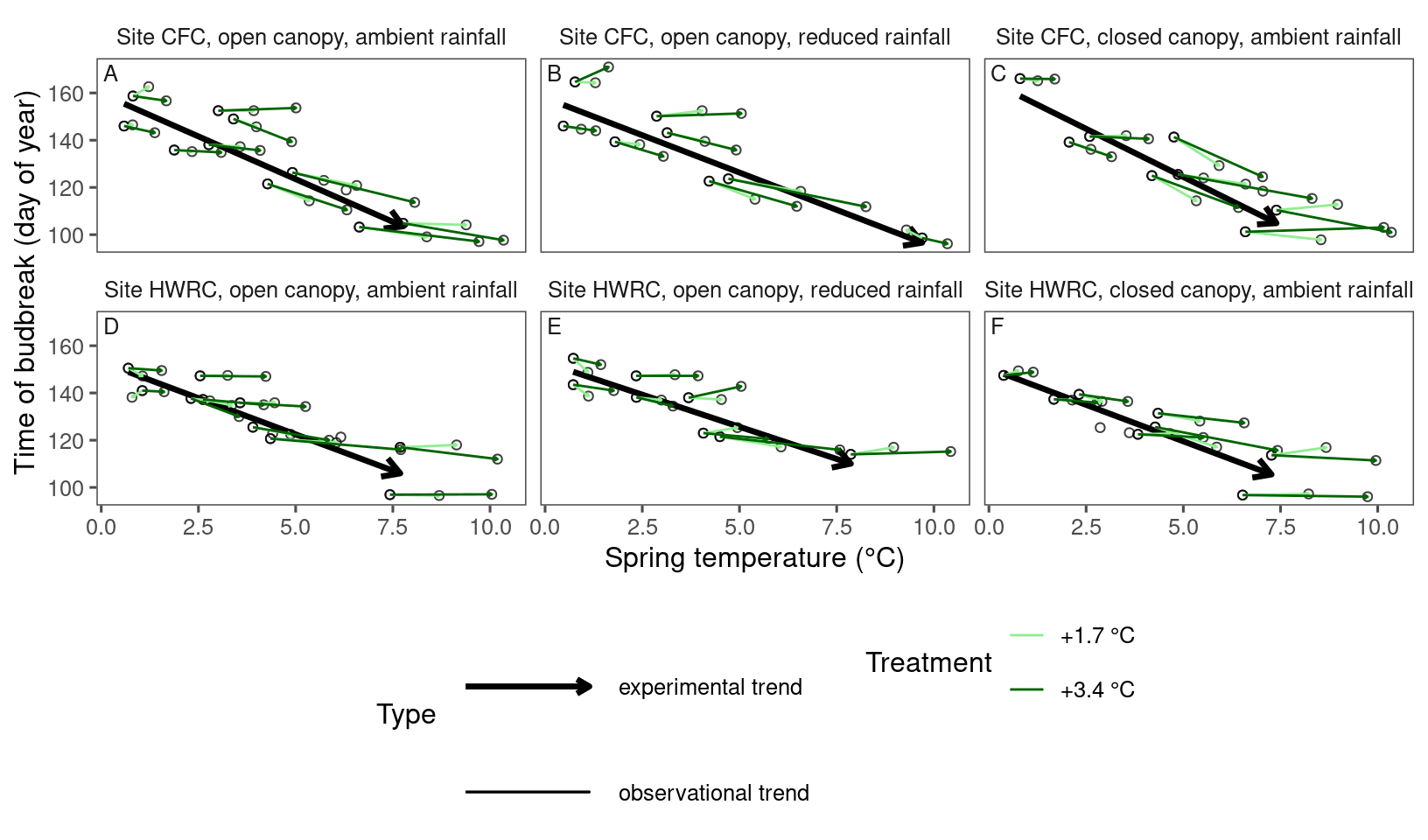
plot_trend(
  df = dat_phenophase_time_summ %>%
    filter(phenophase == "budbreak") %>%
    filter(species == "pinba"),
  dat_climate = dat_climate_spring_summ,
  type = "phenophase",
  side_by_side = T
)
plot_trend(
  df = dat_phenophase_time_summ %>%
    filter(phenophase == "budbreak") %>%
    filter(species == "pinst"),
  dat_climate = dat_climate_spring_summ,
  type = "phenophase",
  side_by_side = T
)
Plot comparisons of coefficients
Train model with temperature difference, baseline temperature, and the interaction of the two.
dat_climate_spring_ambient <- calc_climate_ambient(dat_climate = dat_climate_spring, dat_phenophase)
dat_climate_spring_diff <- calc_climate_diff(dat_climate = dat_climate_spring, dat_climate_ambient = dat_climate_spring_ambient)
(df_treatment_effect_on_climate <- summ_treatment_effect_on_climate(dat_climate_spring_diff))
## # A tibble: 9 × 5
## heat_name water_name canopy temp mois
## <fct> <fct> <fct> <chr> <chr>
## 1 ambient ambient open 3.27e-17 ± 0.188 -2.04e-18 ± 0.0227
## 2 +1.7 °C ambient open 0.925 ± 0.564 -0.0014 ± 0.0228
## 3 +3.4 °C ambient open 1.86 ± 0.834 -0.0124 ± 0.0231
## 4 ambient reduced open -1.64e-17 ± 0.196 6.31e-19 ± 0.0111
## 5 +1.7 °C reduced open 0.81 ± 0.56 0.00383 ± 0.0208
## 6 +3.4 °C reduced open 1.64 ± 0.869 -0.00719 ± 0.0168
## 7 ambient ambient closed 2.4e-17 ± 0.183 5.2e-18 ± 0.0372
## 8 +1.7 °C ambient closed 1.1 ± 0.518 0.00267 ± 0.0365
## 9 +3.4 °C ambient closed 2.12 ± 0.947 -0.00462 ± 0.0351df_plot_ambient <- summ_treatment(dat_phenophase) %>%
filter(heat_name == "ambient") %>%
distinct(site, water_name, canopy, block, plot, year)
dat_climate_daily %>%
left_join(
summ_treatment(dat_phenophase)
) %>%
filter(water == "_", canopy == "open") %>%
group_by(heat_name, doy) %>%
summarize (temp = mean(temp_ag, na.rm = TRUE)) %>%
ggplot()+
geom_line(aes(x = doy, y = temp, color = heat_name)) +
geom_vline(aes(xintercept = "2025-03-15" %>% lubridate::date () %>% lubridate::yday()), linetype = "dashed", col = "red") +
geom_vline(aes(xintercept = "2025-05-15" %>% lubridate::date () %>% lubridate::yday()), linetype = "dashed", col = "red") +
scale_color_manual(values = c("ambient" = "black", "+1.7 °C" = "light green", "+3.4 °C" = "dark green"), name = "Warming\ntreatment") +
labs(x = "Day of year", y = "Mean temperature (°C)")
dat_climate_spring_ambient %>%
  ggplot(aes(x = temp, y = mois, col = site, group = site)) +
  geom_point() +
  geom_smooth(method = "lm", se = FALSE)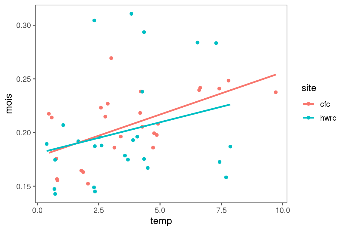
Examine number of years
dat_phenophase_time_clean %>%
  group_by(species, canopy, water_name) %>%
  summarise(n_year = n_distinct(year)) %>%
  arrange(n_year)
## # A tibble: 52 × 4
## # Groups: species, canopy [38]
## species canopy water_name n_year
## <chr> <fct> <fct> <int>
## 1 aseca open reduced 1
## 2 aseca closed ambient 1
## 3 berpa open ambient 1
## 4 pigcl open ambient 1
## 5 query closed ambient 1
## 6 qumas open ambient 1
## 7 lonmo open ambient 2
## 8 lonmo open reduced 2
## 9 lonta open ambient 2
## 10 lonta open reduced 2
## # ℹ 42 more rowsdat_phenophase_time <- dat_phenophase_time_clean %>%
mutate(model = str_c(species, canopy, water_name, sep = "_")) %>%
group_by(species, model) %>%
mutate(group = str_c(site, year, sep = "_") %>% factor() %>% as.integer()) %>%
filter(n_distinct(year) >= 6) %>%
ungroup() %>%
tidy_treatment_code()
dat_phenophase_time_cov <- dat_phenophase_time %>%
left_join(dat_climate_spring_diff) %>%
{
# Extract only the `center` and `std` attributes
attributes(.)$center <- attr(dat_climate_spring_diff, "center")
attributes(.)$sd <- attr(dat_climate_spring_diff, "sd")
.
} %>%
drop_na(delta_temp_std)I used a model with continuous temperature difference (with ambient), continuous baseline temperature, and their interaction.
test_phenophase_lme(data = dat_phenophase_time_cov, path = "alldata/intermediate/phenophase/continuous_bg/", season = "spring", chains = 1, iter = 4000, version = 4, num_cores = 5)
tidy_stanfit_all(path = "alldata/intermediate/phenophase/continuous_bg/", season = "spring", num_cores = 20)
calc_bayes_derived(path = "alldata/intermediate/phenophase/continuous_bg/", season = "spring", type = "phenophase", random = F, num_cores = 20)
I also tried a version that experimental treatment was discrete and baseline temperature was continuous. This version can reproduce PNAS paper negative interaction between warming treatment and baseline temperature, but not the previous model. I suspect that this is because experimental effect on temperature was smaller at lower baseline temperature.
test_phenophase_lme(data = dat_phenophase_time_cov, path = "alldata/intermediate/phenophase/discrete_bg/", season = "spring", chains = 1, iter = 4000, version = 5, num_cores = 5)
tidy_stanfit_all(path = "alldata/intermediate/phenophase/discrete_bg/", season = "spring", num_cores = 20)
calc_bayes_derived(path = "alldata/intermediate/phenophase/discrete_bg/", season = "spring", type = "phenophase", random = F, num_cores = 20)
df_lme_spring <- read_bayes_all(path = "alldata/intermediate/phenophase/continuous_bg/", season = "spring", full_factorial = F, derived = T, tidy_mcmc = T) %>%
tidy_model_name() %>%
tidy_species_name()p_lme_summ <- plot_bayes_summary(
df_lme_spring %>%
filter(response == "start") %>%
filter(covariate == "warming"),
background = "full"
)
p_lme_summ$p_coef_line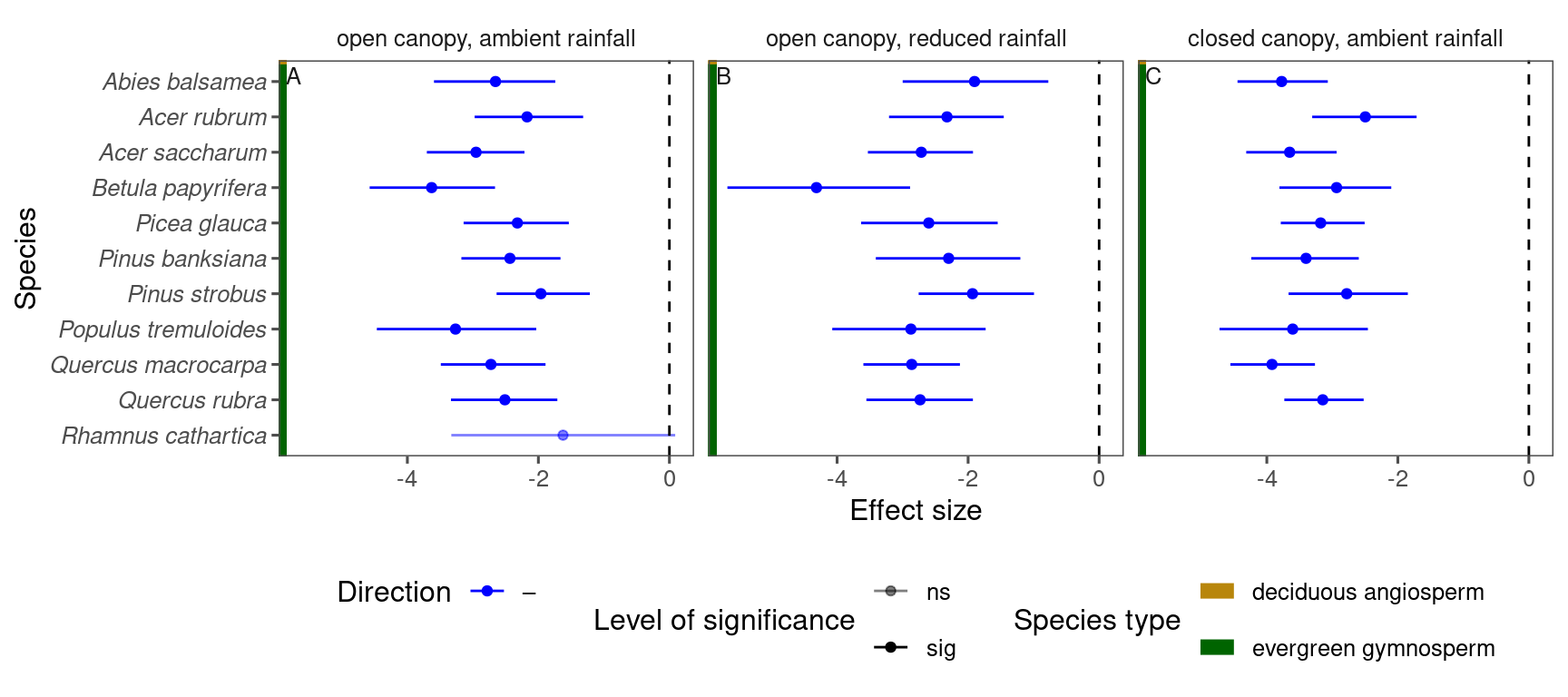
p_lme_summ <- plot_bayes_summary(
  df_lme_spring %>%
    filter(response == "start") %>%
    filter(covariate == "temperature"),
  background = "full"
)
p_lme_summ$p_coef_line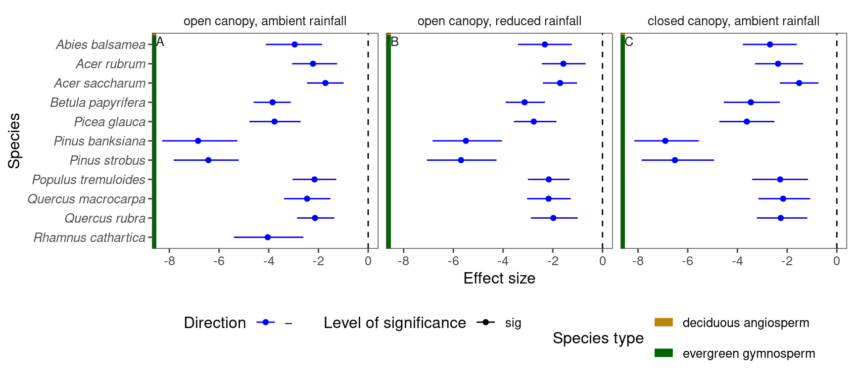
p_lme_summ <- plot_bayes_summary(
  df_lme_spring %>%
    filter(response == "start") %>%
    filter(covariate == "warming x temperature"),
  background = "full"
)
p_lme_summ$p_coef_line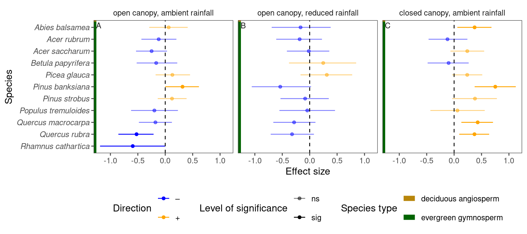
df_lme_spring %>%
  filter(species == "aceru") %>%
  filter(response == "start") %>%
  filter(model == "open canopy, ambient rainfall") %>%
  filter(covariate == "warming" | covariate == "temperature") %>%
  mutate(covariate = factor(covariate, levels = c("warming", "temperature"), labels = c("experimental", "observational"))) %>%
  select(value, covariate) %>%
  ggplot() +
  geom_density(aes(x = value, fill = covariate), position = "identity", alpha = 0.5) +
  scale_fill_manual(values = c("experimental" = "dark green", "observational" = "black"), name = "") +
  theme(legend.position = "bottom")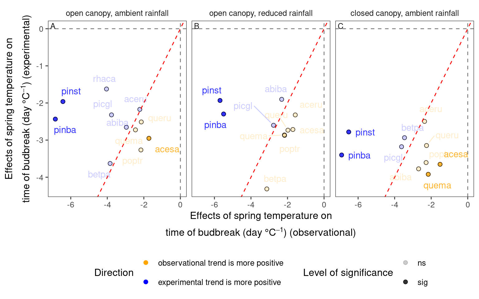
df_lme_spring %>%
  filter(species == "aceru") %>%
  filter(response == "start") %>%
  filter(model == "open canopy, ambient rainfall") %>%
  filter(covariate == "warming" | covariate == "temperature") %>%
  mutate(covariate = factor(covariate, levels = c("warming", "temperature"), labels = c("experimental", "observational"))) %>%
  select(n, value, covariate) %>%
  pivot_wider(names_from = covariate, values_from = value) %>%
  mutate(diff = experimental - observational) %>%
  mutate(covariate = "experimental - observational") %>%
  select(value = diff, covariate) %>%
  ggplot() +
  geom_density(aes(x = value, fill = covariate), position = "identity", alpha = 0.5) +
  scale_fill_manual(values = c("experimental - observational" = "dark grey"), name = "") +
  theme(legend.position = "bottom") +
  geom_vline(xintercept = 0, linetype = "dashed", col = "red")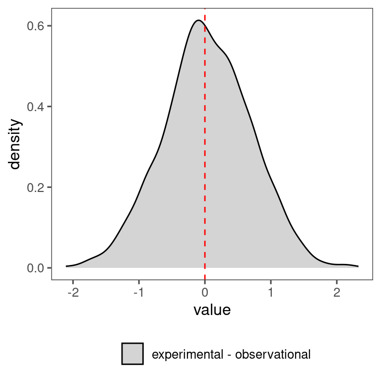
df_compare_trends_spring <- test_compare_trends(df_lme_spring) %>%
  mutate(season = "spring") %>%
  tidy_phenophase_name(season = "spring")
plot_trend_compare(df_compare_trends_spring %>% filter(response == "start", season == "spring"), species_label = T, ci = F)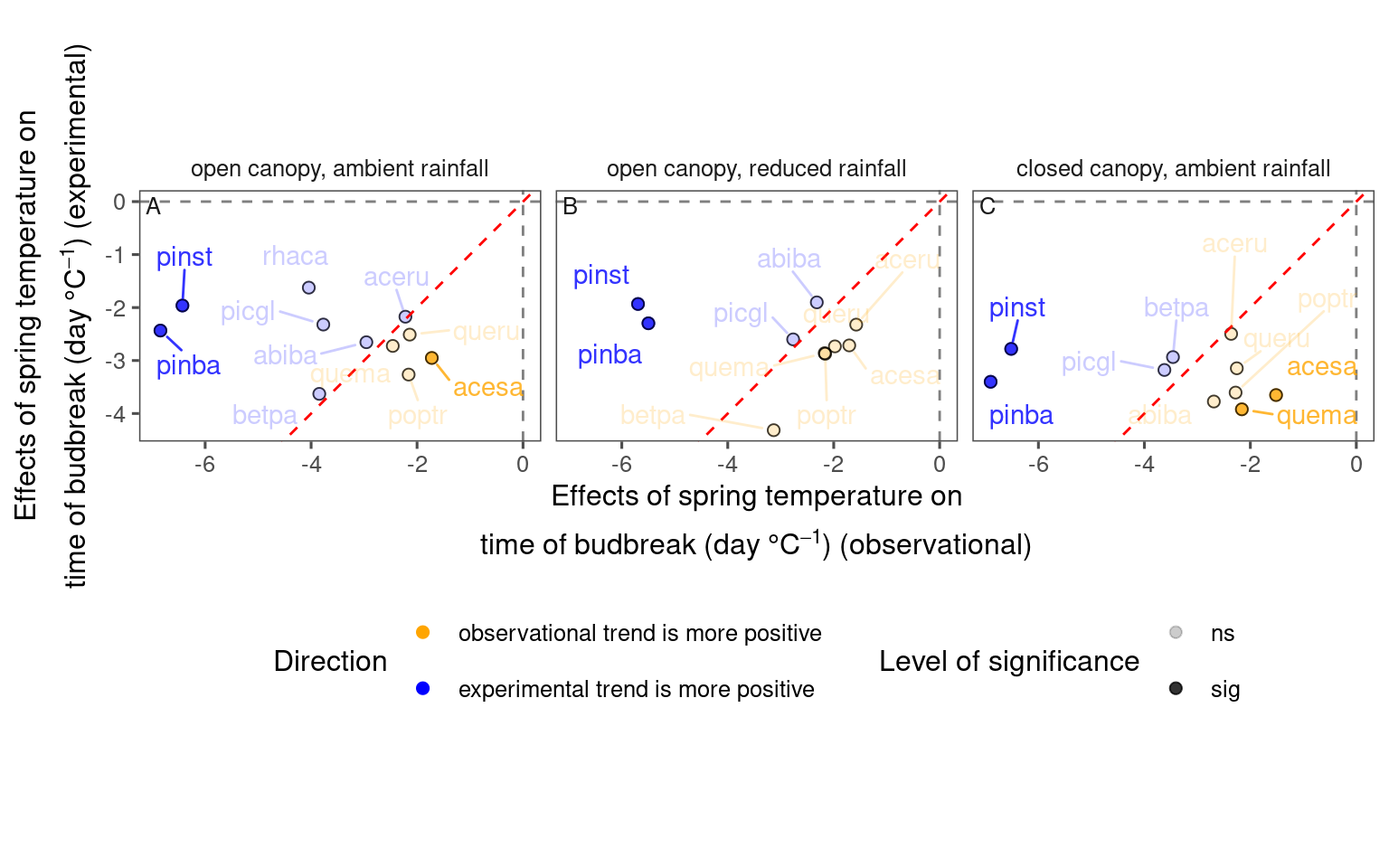
df_compare_trends_spring %>%
  filter(response == "start", season == "spring") %>%
  group_by(sign, sig) %>%
  summarise(n = n(), .groups = "drop") %>%
  mutate(perc = n / sum(n))
## # A tibble: 4 × 4
## sign sig n perc
## <chr> <chr> <int> <dbl>
## 1 + ns 9 0.290
## 2 + sig 6 0.194
## 3 – ns 13 0.419
## 4 – sig 3 0.0968